67 lines
3.0 KiB
Markdown
67 lines
3.0 KiB
Markdown
|
---
|
|||
|
|
title: CSS3 Border Radius Property
|
|||
|
|
localeTitle: CSS3 Border Radius属性
|
|||
|
|
---
|
|||
|
|
## CSS3 Border Radius属性
|
|||
|
|
|
|||
|
|
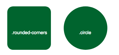
使用CSS3,您可以使用`border-radius`属性为任何元素提供“圆角”。该值可以是任何有效的CSS长度单位。
|
|||
|
|
|
|||
|
|
```css
|
|||
|
|
.rounded-corners {
|
|||
|
|
border-radius: 20px;
|
|||
|
|
}
|
|||
|
|
|
|||
|
|
.circle {
|
|||
|
|
border-radius: 50%;
|
|||
|
|
}
|
|||
|
|
```
|
|||
|
|
|
|||
|
|
|
|||
|
|
|
|||
|
|
**注意:** `border-radius`属性实际上是`border-top-left-radius` , `border-top-right-radius` , `border-bottom-right-radius`和`border-bottom-left-radius`属性的简写属性。
|
|||
|
|
|
|||
|
|
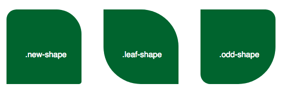
如果只提供一个值,则所有四个角的border-radius将相同,如上例所示。但您也可以选择为每个角指定不同的值。
|
|||
|
|
|
|||
|
|
```css
|
|||
|
|
.new-shape {
|
|||
|
|
border-radius: 20px 50px 5px 0; /* top left, top right, bottom right, bottom left */
|
|||
|
|
}
|
|||
|
|
```
|
|||
|
|
|
|||
|
|
如果仅提供两个值,则第一个值适用于左上角和右下角,第二个值适用于右上角和左下角。
|
|||
|
|
|
|||
|
|
```css
|
|||
|
|
.leaf-shape {
|
|||
|
|
border-radius: 0 50%;
|
|||
|
|
}
|
|||
|
|
```
|
|||
|
|
|
|||
|
|
如果设置了三个值,则第一个值再次应用于左上半径,第二个值指示右上角和左下角,留下第三个值以指示右下角。
|
|||
|
|
|
|||
|
|
```css
|
|||
|
|
.odd-shape {
|
|||
|
|
border-radius: 0 20px 50%;
|
|||
|
|
}
|
|||
|
|
```
|
|||
|
|
|
|||
|
|
|
|||
|
|
|
|||
|
|
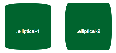
拐角的圆角不必完全对称。您可以使用斜杠(“/”)指定水平和垂直半径,以获得具有椭圆形状的角。 \`\`\`CSS .elliptical-1 { border-radius:50px / 10px; / \*水平半径/垂直半径\* / } .elliptical-2 { border-radius:10px / 50px; }
|
|||
|
|
```
|
|||
|
|
|
|||
|
|
|
|||
|
|
Since only one pair of values is given in the above examples, all four corners are the same. But, of course, if you want a more complex shape, you may supply up to four values for the horizontal radiuses and four for the vertical radiuses.
|
|||
|
|
```
|
|||
|
|
|
|||
|
|
CSS .elliptical-3 { border-radius:50px 20px 50px 20px / 20px 50px 20px 50px; / \*水平左上,水平右上,水平右下,水平左下/垂直左上,垂直右上,垂直右下,垂直左下\* / }
|
|||
|
|
```
|
|||
|
|
Notice how the shorthand above produces the same result as specifying individual properties below. Be aware that when corners are set individually the values are space-separated instead of slash-separated.
|
|||
|
|
```
|
|||
|
|
|
|||
|
|
CSS .elliptical-4 { border-top-left-radius:50px 20px; / \*水平半径,垂直半径\* / border-top-right-radius:20px 50px; border-bottom-right-radius:50px 20px; border-bottom-left-radius:20px 50px; } \`\`\` 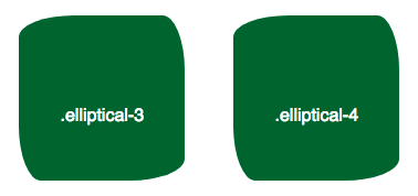
|
|||
|
|
|
|||
|
|
### 更多信息:
|
|||
|
|
|
|||
|
|
* CSS技巧: [CSS技巧](https://css-tricks.com/almanac/properties/b/border-radius/)
|
|||
|
|
* MDN文档: [MDN](https://developer.mozilla.org/en-US/docs/Web/CSS/border-radius)
|
|||
|
|
* 浏览器支持: [caniuse](http://caniuse.com/#search=border-radius)
|