63 lines
4.3 KiB
Markdown
63 lines
4.3 KiB
Markdown
|
---
|
|||
|
|
title: CSS3 Border Radius Property
|
|||
|
|
localeTitle: CSS3 الحدود شعاع الملكية
|
|||
|
|
---
|
|||
|
|
## CSS3 الحدود شعاع الملكية
|
|||
|
|
|
|||
|
|
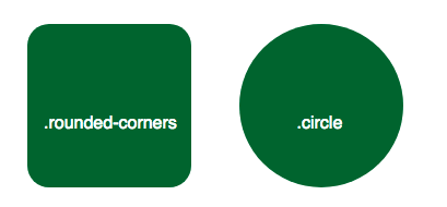
باستخدام CSS3 ، يمكنك إعطاء أي عنصر "زوايا دائرية" ، باستخدام خاصية `border-radius` . يمكن أن تكون القيمة بأي وحدة طول CSS صالحة.
|
|||
|
|
|
|||
|
|
` .rounded-corners {
|
|||
|
|
border-radius: 20px;
|
|||
|
|
}
|
|||
|
|
|
|||
|
|
.circle {
|
|||
|
|
border-radius: 50%;
|
|||
|
|
}
|
|||
|
|
`
|
|||
|
|
|
|||
|
|
|
|||
|
|
|
|||
|
|
**ملاحظة:** خاصية `border-radius` هي في الواقع خاصية اختزال `border-top-left-radius` `border-top-right-radius` ، `border-top-left-radius` `border-top-right-radius` `border-bottom-right-radius` ، `border-top-right-radius` `border-bottom-right-radius` `border-bottom-left-radius` .
|
|||
|
|
|
|||
|
|
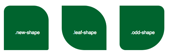
إذا تم توفير قيمة واحدة فقط ، فسيكون نصف قطر الحدود هو نفسه لجميع الزوايا الأربع ، كما هو موضح في الأمثلة السابقة. ولكن لديك أيضًا خيار تحديد قيم مختلفة لكل ركن.
|
|||
|
|
|
|||
|
|
`.new-shape {
|
|||
|
|
border-radius: 20px 50px 5px 0; /* top left, top right, bottom right, bottom left */
|
|||
|
|
}
|
|||
|
|
`
|
|||
|
|
|
|||
|
|
في حالة تقديم قيمتين فقط ، يتم تطبيق القيمة الأولى على الركن الأيمن العلوي والسفلي ، وتنطبق القيمة الثانية على الركن الأيمن العلوي والسفلي الأيسر.
|
|||
|
|
|
|||
|
|
`.leaf-shape {
|
|||
|
|
border-radius: 0 50%;
|
|||
|
|
}
|
|||
|
|
`
|
|||
|
|
|
|||
|
|
إذا تم تعيين ثلاث قيم ، فسيتم تطبيق القيم الأولى مرة أخرى على نصف قطر أعلى اليسار ، تشير القيمة الثانية إلى اليمين العلوي والسفلي الأيسر ، تاركة القيمة الثالثة للإشارة إلى الركن السفلي الأيمن.
|
|||
|
|
|
|||
|
|
`.odd-shape {
|
|||
|
|
border-radius: 0 20px 50%;
|
|||
|
|
}
|
|||
|
|
`
|
|||
|
|
|
|||
|
|
|
|||
|
|
|
|||
|
|
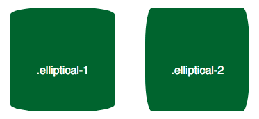
لا يجب أن يكون تقريب الزاوية متماثلًا تمامًا. يمكنك تحديد كل من الشعاعين الأفقي والعمودي باستخدام شرطة مائلة ("/") لتحقيق زاوية ذات شكل بيضاوي الشكل. \`\` \`المغلق .elliptical-1 { border-radius: 50px / 10px؛ / \* نصف القطر الأفقي / نصف القطر الرأسي \* / } .elliptical-2 { border-radius: 10px / 50px؛ }
|
|||
|
|
|
|||
|
|
`
|
|||
|
|
|
|||
|
|
Since only one pair of values is given in the above examples, all four corners are the same. But, of course, if you want a more complex shape, you may supply up to four values for the horizontal radiuses and four for the vertical radiuses.
|
|||
|
|
`
|
|||
|
|
|
|||
|
|
المغلق .elliptical-3 { border-radius: 50px 20px 50px 20px / 20px 50px 20px 50px؛ / \* أفقية من اليسار إلى اليمين ، أعلى يمين أفقي ، أفقي من أسفل إلى اليمين ، أفقي من أسفل يسار / عمودي إلى يسار علوي ، عمودي أعلى يمين ، عمودي إلى أسفل يمين ، عمودي إلى أسفل يسار \* / }
|
|||
|
|
|
|||
|
|
`Notice how the shorthand above produces the same result as specifying individual properties below. Be aware that when corners are set individually the values are space-separated instead of slash-separated.
|
|||
|
|
`
|
|||
|
|
|
|||
|
|
المغلق .elliptical-4 { نصف قطر أعلى يمين - أقصى: 50 بكسل 20 بكسل ؛ / \* نصف القطر الأفقي ، نصف القطر الرأسي \* / نصف قطر أعلى يمين الحد: 20px 50px؛ نصف قطر الحد السفلي - اليمين - اليمين: 50 بكسل × 20 بكسل ؛ border-bottom-left-radius: 20px 50px؛ } \`\` \` 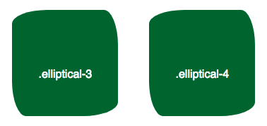
|
|||
|
|
|
|||
|
|
### معلومات اكثر:
|
|||
|
|
|
|||
|
|
* CSS Tricks: [CSS Tricks](https://css-tricks.com/almanac/properties/b/border-radius/)
|
|||
|
|
* وثائق [MDN](https://developer.mozilla.org/en-US/docs/Web/CSS/border-radius) : [MDN](https://developer.mozilla.org/en-US/docs/Web/CSS/border-radius)
|
|||
|
|
* دعم المتصفح: [caniuse](http://caniuse.com/#search=border-radius)
|