80 lines
2.7 KiB
Markdown
80 lines
2.7 KiB
Markdown
|
---
|
||
|
|
title: Margin Property
|
||
|
|
---
|
||
|
|
## Margin Property
|
||
|
|
|
||
|
|
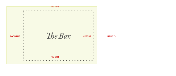
The margin property is the space around an element, as opposed to padding, which is the space within the element. The margin is transparent and is the outermost element in the Box Model (see diagram below).
|
||
|
|
|
||
|
|
|
||
|
|
|
||
|
|
Source: https://css-tricks.com/the-css-box-model/
|
||
|
|
|
||
|
|
### Setting Margin
|
||
|
|
|
||
|
|
There are multiple ways of setting the margin of an element.
|
||
|
|
|
||
|
|
The simple way...
|
||
|
|
|
||
|
|
```css
|
||
|
|
margin: 10px;
|
||
|
|
```
|
||
|
|
This will put 10 pixels of space completely around the element.
|
||
|
|
|
||
|
|
You can also put different amounts of space on each side of an element. For example:
|
||
|
|
|
||
|
|
```css
|
||
|
|
margin-top: 10px;
|
||
|
|
margin-bottom: 15px;
|
||
|
|
margin-left: 20px;
|
||
|
|
margin-right: 25px;
|
||
|
|
```
|
||
|
|
|
||
|
|
However, there is a shorthand one can use when defining different sides of an element. It starts at the top and goes clockwise around the element (top, right, bottom, left). For example, the about code would be written in shorhand like this:
|
||
|
|
|
||
|
|
```css
|
||
|
|
margin: 10px 25px 15px 25px;
|
||
|
|
```
|
||
|
|
|
||
|
|
Additionally, if the bottom and top margins are the same, and the left and right margins are the same, it can be written like this:
|
||
|
|
|
||
|
|
```css
|
||
|
|
margin: 10px 20px;
|
||
|
|
```
|
||
|
|
|
||
|
|
where the top and bottom margins are 10 pixels and the left and right margins are 20 pixels.
|
||
|
|
|
||
|
|
### Other Property Values
|
||
|
|
|
||
|
|
auto - the browser calculates the margins.
|
||
|
|
|
||
|
|
initial - set the property to its initial value
|
||
|
|
|
||
|
|
inherit - element inherits the margin from its parent element
|
||
|
|
|
||
|
|
### Measuring Space
|
||
|
|
|
||
|
|
Just like there are multiple ways of setting the margin, there are also multiple ways of measuring margin.
|
||
|
|
|
||
|
|
px - Measurement in pixels, the standard unit of measurement of screen space.
|
||
|
|
|
||
|
|
% - Percentage of the screen. This will make the element shrink and grow with the browser and is one of the recommended units of measurement for responsive web design.
|
||
|
|
|
||
|
|
em - size unit relative to the font-size of the current element.
|
||
|
|
|
||
|
|
rem - size unit relative to font-size of the root element of the page.
|
||
|
|
|
||
|
|
[Here](https://www.w3schools.com/CSSref/css_units.asp) is a guide on CSS units.
|
||
|
|
|
||
|
|
|
||
|
|
<a href='https://github.com/freecodecamp/guides/blob/master/README.md' target='_blank' rel='nofollow'>This quick style guide will help ensure your pull request gets accepted</a>.
|
||
|
|
|
||
|
|
<!-- The article goes here, in GitHub-flavored Markdown. Feel free to add YouTube videos, images, and CodePen/JSBin embeds -->
|
||
|
|
|
||
|
|
#### More Information:
|
||
|
|
<!-- Please add any articles you think might be helpful to read before writing the article -->
|
||
|
|
* [W3 Schools](https://www.w3schools.com/CSSref/pr_margin.asp)
|
||
|
|
* [MDN](https://developer.mozilla.org/en-US/docs/Web/CSS/margin)
|
||
|
|
* [CSS Tricks](https://css-tricks.com/almanac/properties/m/margin/)
|
||
|
|
|
||
|
|
|