---
id: bad87fee1348bd9acde08812
title: Tornar imagens responsivas a dispositivos móveis
challengeType: 0
forumTopicId: 18232
dashedName: make-images-mobile-responsive
---
# --description--
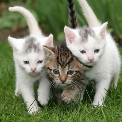
Primeiro, adicione uma nova imagem abaixo da existente. Defina o seu atributo `src` como `https://cdn.freecodecamp.org/curriculum/cat-photo-app/running-cats.jpg`.
Seria ótimo se essa imagem pudesse ser exatamente do tamanho da nossa tela do celular.
Felizmente, com o Bootstrap, tudo que precisamos fazer é adicionar a classe `img-responsive` para a nossa imagem. Faça isso, e a imagem deve encaixar perfeitamente na largura da página.
# --hints--
Você deve ter o total de duas imagens.
```js
assert($('img').length === 2);
```
A nova imagem deve estar abaixo da antiga e ter a classe `img-responsive`.
```js
assert($('img:eq(1)').hasClass('img-responsive'));
```
A nova imagem não deve ter a classe `smaller-image`.
```js
assert(!$('img:eq(1)').hasClass('smaller-image'));
```
A nova imagem deve ter um `src` de `https://cdn.freecodecamp.org/curriculum/cat-photo-app/running-cats.jpg`.
```js
assert($('img:eq(1)').attr('src') === 'https://cdn.freecodecamp.org/curriculum/cat-photo-app/running-cats.jpg');
```
O novo elemento `img` deve ter uma tag de fechamento.
```js
assert(
code.match(//g).length === 2 &&
code.match(/